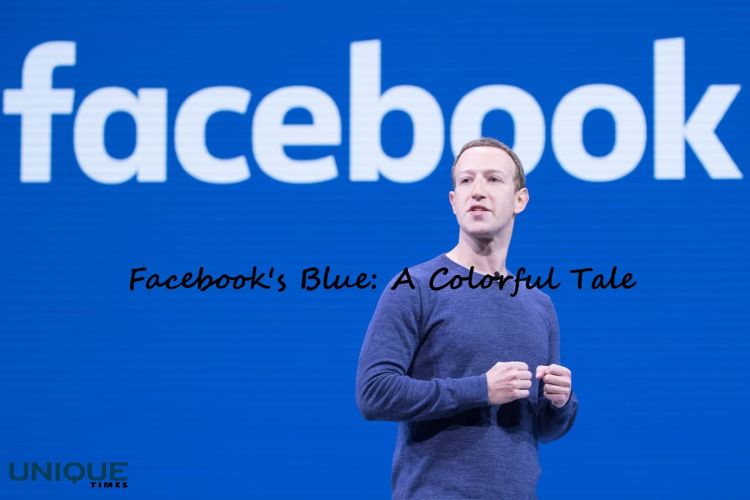
The Colorful Reason Behind Facebook’s Blue Dominance
In the world of social media, Facebook stands out not just for its impact on global communication but also for its distinctive blue color scheme. Have you ever wondered why Facebook’s iconic hue is blue? The answer lies in a surprising and personal aspect of its founder, Mark Zuckerberg.
Seeing the World Differently
Mark Zuckerberg’s red-green color blindness, also known as red-green color deficiency or color vision deficiency, has had an unexpected influence on the platform’s design. Red-green color blindness is the most common form of color blindness, affecting a significant portion of the population. People with this condition have difficulty distinguishing between the colors red and green, as well as certain shades of these colors.
A Blue Revelation
Given his color blindness, Zuckerberg opted for blue as Facebook’s primary color because he can see it more clearly. Blue is a color that’s generally well-perceived by individuals with red-green color blindness, making it a practical and inclusive choice for the platform’s design. This decision turned out to have far-reaching implications, as the blue color scheme became synonymous with Facebook’s brand identity.
The Power of Blue
Beyond catering to Zuckerberg’s personal vision, the choice of blue for Facebook’s color scheme aligns with the psychology of color. Blue is often associated with qualities like trust, reliability, and calmness. It’s no wonder that Facebook, a platform where people connect, share, and communicate, would want to evoke feelings of trust and comfort.
An Unintended Legacy
Little did Zuckerberg know that his consideration for his own visual limitations would result in such a powerful and recognizable aspect of the Facebook experience. Today, Facebook’s blue interface is instantly recognizable to billions of users around the world, illustrating how a seemingly simple decision can shape the identity of a global tech giant.
In conclusion, the story behind Facebook’s blue color scheme is a reminder that even the most mundane design choices can have profound impacts. Mark Zuckerberg’s red-green color blindness led to the selection of a color that’s not only aesthetically pleasing but also inclusive and emotionally resonant. It’s a testament to how a personal trait can unintentionally become an integral part of a brand’s identity and user experience.
Picture Courtesy: Google/images are subject to copyright